This section introduces and summarizes some special features of the STARfish app, along with basic instructions for using it, including a video. The app itself has built-in instructions that pop up in red letters. Some alternative presentation diagrams are illustrated. An automated Design Report reproduces these along with the criteria and rationales given by users for the scores. Because STARfish is totally transparent and designed to avoid greenwashing, it can be used by third party assessors, architects and planners, clients and citizens, and especially students. Assistance in using the open-source STARfish is available via the website contact box.
NOTE: It may be useful to view a general introductory video first [here].
1. Some special features of the STARfish app
The STARfish net-positive design and assessment app is the inverse of other building certification, rating and assessment tools. Many differences between the STARfish app and typical green building rating and marketing tools are described in the book Net Positive Design (2020) and other publications, so only a few are noted here.
Transparency is missing in most rating tools. Although incremental targets and rules are often vetted and approved by building industry representatives, the primary clients, the underlying bases for the rules are not accessible to most paying users. The performance standards – and maximum points – are often based on what is deemed achievable now by industry, not what would actually be sustainable.
Multifunctional and adaptable design is not rewarded in most rating tools. For example, a design element or action may improve both ecological and human health, but it only counts in one category if at all. Other impacts are sometimes double counted. STARfish diagrams help to remind people that, through better design, actions can have multiple and synergistic benefits in different domains.
Weightings and reasons for weightings are usually hidden in rating tools. For instance, carbon emissions are loaded or weighted so that they count for more than toxic waste or biodiversity losses. In STARfish, the weightings and their consequences are transparent, and users can modify the weightings if valid, persuasive reasons are provided. That means such decisions can also be challenged others.
Flexibility is accommodated by STARfish since design outcomes vary with the site, building functions, type of negative or positive impact under consideration, and so on. Most rating tools have generic or prescriptive rules based on typical buildings or practices which can be inappropriate in some locations. STARfish is applicable to any location and site, but it can also be modified to suit different purposes.
The slider is used to locate the impact in relation to a continuum from negative to restorative/regenerative to net-positive outcomes. This approach avoids many problems of other design tools, such as thresholds, their prescriptive rules, and the fact that they only include impacts that have traditionally been measured. As the slider moves, the app automatically calculates and displays the changes.
Reasoning (versus rules) is emphasized. Early on, many life cycle data used will be estimates, but as more data becomes available, the calculations are easily updated. The reasons for the score are stated in relation to each whole-system benchmark. The supporting analyses and evidence are produced automatically in a Formatted Report, along with the STARfish scores and diagrams.
2. Instructions for using STARfish
The app itself has pop-up instructions on every page. The video also provides a basic introduction. However, here is a step-by-step description for anyone that may find it helpful.
Download STARfish. A diagram will appear. Go to ‘settings’ in the top menu and click ‘open’. Select either the ‘Complex’ diagram for a large development, or the ‘Main’ or Simple Diagram for a small project. In both cases, you can start with one and add or subtract Legs (impact factors) or Satellites (sets of related impact factors) as you progress.
Visual presentation: Every visual aspect of the diagrams can be manipulated for presentation purposes. Some of the options are as follows:
Under the ‘STARfish’ heading above the diagram, you can:
- Control the labels (their size, colours, borders and line thickness, etc.) in the ‘Global STARfish’.
- Move the labels by clicking ‘Turn on label reposition mode’.
- Select from a range of diagrams (described above) depending on which seems to communicate better to you or your audience.
- Chose line thicknesses and lengths of circles or Legs and so on, in the ‘Axis and Rulers’.
Under the ‘Designer’ heading, you can:
- Change the distances between diagrams and sub-diagrams.
- Make the radius of a diagram bigger or smaller.
- Rotate individual diagrams or the whole cluster of diagrams.
Under the ‘Data’ heading, you can ‘select’ the diagram type that you want to use. You will see the impact category and its subsets in the left column under ‘Data’.
- Click ‘Edit’ to change the names of impact factors, add new ones, or delete ones.
- Click ‘Attach new sub-diagram’ to add a whole new set of impacts and give it a weighting if necessary.
- To see another set of benchmarks in that diagram, select the name of the impact at the top of the left-hand column.
The Slider: Move the red (negative impact) slider. (If the slider area does not show the movable triangles, it means there is a sub-diagram that feeds into that diagram.) As the slider moves from -10 towards 0, the benchmarks appear in the text box below it (more benchmarks can be added by the user). You judge where the slider should sit on the spectrum, depending on how bad the impact is in relation to the stated benchmarks. As more information becomes available this estimate is easily refined and automatically calculated.
Note that negative impacts do not disappear as otherwise positive impacts might appear to remediate them.
Do the same for the regenerative and net-positive impacts. Regenerative impacts start from where the negative slider ends up. Positive impacts may exceed the ‘zero’ point (set at sustainable conditions, not zero harm) to become net-positive. Remember to save changes via the ‘Settings’ menu.
Report reasons: Click ‘Report reasons for the given values’, and a box appears for entering the rationale for where the sliders are positioned. You can add new benchmarks for new Legs or sub-diagrams, but the basic ones provided in the app are locked in. Your reasons may address unique circumstances or impediments concerning the project or site.
Export report: Go to ‘Settings’ again and click ‘Create Report’. This will show the benchmarks and your reasons for how the project stacks up against the standards. You can also export the final image (in the ‘Settings’ menu).
3. How do the diagrams work?
There is a choice of diagrams to help different app users, their clients, assessors or the general public or to get an overall visual impression of the development impacts of competing design concepts. The Main Diagram is for relatively simple projects. The examples now have about 6 basic criteria each, but more can be added. As a case in point, a 7th Socio-cultural/community Leg was added. The benchmarks can be accessed from the tool and can also be downloaded here. They are also provided in Spanish.
3.1. The Main Diagram
The Main or Simple Diagram provides several core environmental impact categories represented as ‘Legs’ or radii. The diagram provides a graphical representation of the environmental ‘score’ for each category within a net-positive framework. Each impact category can either stand alone or have a sub-diagram (Satellite) attached to it, which has its own sub-categories of impact factors. The app automatically adds up all these secondary impacts instantly.
3.2. The Satellite Diagrams
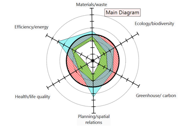
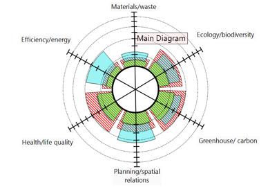
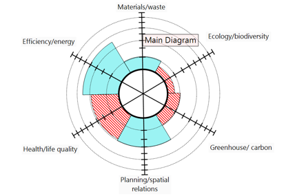
Figure 1 shows the Main or Simple Diagram with no sub-diagrams or Satellites attached. The Legs represent the major impact categories (Materials/waste, Ecology/biodiversity, Greenhouse/carbon, Planning/spatial relations, Health/life quality, Efficiency/energy (the 7th Socio-cultural/community Leg will be added).
The red area represents negative impacts, green represents restorative and regenerative impacts, and blue represents net-positive impacts. The app provides a range of diagrams options for representing these impacts. The different diagrams are described in the ‘Different Diagram Types’ section below. The diagram shown in Figure 1 is a ‘ZeroCircle’ Diagram.
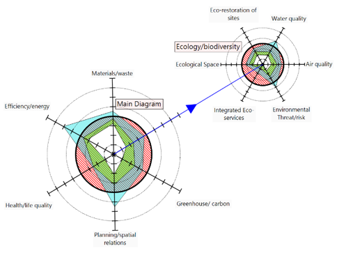
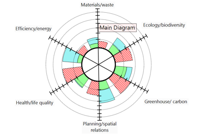
Figure 2 shows the Main (Simple) diagram with a sub-diagram attached to the Ecology/biodiversity impact category. This is divided into 6 sub-categories. The slider is used to estimate the impact for each sub-category. The Satellite diagrams help to visualize the cumulative impacts. These estimated impacts are automatically calculated by the app to provide the final score for the Ecology/biodiversity impact category. All Satellite scores feed into the total Main Diagram score instantly.
3.3. Diagram Options
For presentations, you can select from among different diagrams that display the same impacts. A given diagram may help stakeholders, assessors or the general public to comprehend the sustainability impacts of the design. All the example graphics shown below are for the same project with all the same impact scores to demonstrate the different ways of presenting the same information.
ZeroCircle Star Diagram
The ZeroCircle Star is different to the usual radar diagram (Figure 3). The bold circle in the middle of the diagram represents net zero impact (i.e. eliminates all the impacts of the project regarding that impact category). From here, the negative impacts increase as the point on the Leg of the star/polygon moves inwards towards the center. The center point represents the maximum negative impact possible. Restorative and/or regenerative impacts start at that point and move back towards the zero circle in the middle. Being mitigative, these scores do not go beyond zero.
Positive impacts go from the estimated restorative outcomes score outward toward the outer circle (+10). If the outermost part of the star is outside the zero circle, then you have achieved a net-positive result for that particular impact. Therefore, the aim of the ‘game’ is to try to increase the white area, reduce the red area, and get more blue area outside the circle through net-positive design.
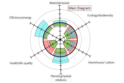
ZeroCircle Pie Diagram
The ZeroCircle Pie Diagram (Figure 4) is the same as the ZeroCircle Star diagram except that a pie diagram is used instead. Instead of starting at the center of the diagram, your start on the zero circle, and then move inwards to record negative impacts with the slider. Then, you record restorative and/or regenerative impacts, and then you record the net-positive impacts. The app calculates the totals and different diagrams provide these optional views automatically.
Overlap Star and Overlap Pie Diagrams
The Overlap-Star and Overlap-Pie diagrams (Figures 5 and 6) are more traditional forms of radar diagrams where a score of zero sits at the center of the diagram, and the score increases as you move outwards on the Legs. Since negative impacts are represented in red in the example diagrams below, the more negative the impact, the further the red pie slice or red star corner moves away from the center. Restorative impacts and positive impacts are represented in green and blue respectively. In these diagrams (as in the ZeroCircle diagrams), the restorative and positive scores are added together, with the positive pie slice, or star ‘corner’ goes from where the restorative pie slice or star corner finished. A positive result is achieved when the restorative-positive combined pie ‘slice’ appears further out from the center than the negative part.
Note that when only negative and positive impacts are shown and simply added up, greenwashing is possible because negative impacts that could have been avoided by better design cannot simply be erased or offset by positive actions. Negative impacts are still cumulative, even if many positive impacts are added on.
Bar Chart Diagram
The Bar Chart graph (Figure 7) is just a traditional bar chart – but wrapped in a circular shape. For each Leg, two bars are plotted side by side. One bar is plotted for the negative impacts, and another is plotted for the combined restorative and net-positive impacts. If the restorative/positive bar is bigger than the negative impact bar, then a positive outcome has been achieved for that impact category.
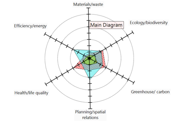
Net Neg-Pos diagram
The Net Neg-Pos diagram (Figure 8) is used to view the overall impact. If the overall impact for a Leg is negative, then the color is red (or other selected color), and a pie slice is drawn. The larger the pie slice the more negative is the total cumulative impact. If the cumulative impact is positive, then the pie slice is blue (or selected color). The larger the blue pie slice, the more positive the cumulative impact is. This is useful for a simple comparison of different preliminary designs.
3.4 The criteria and indicators
The benchmarks that are embedded in the tool can be downloaded here. However, they can also be seen altogether in the app by pressing ‘generate report’ in the settings menu.
Entirely new Tier 1, 2 or 3 impact categories and benchmarks can be added, where special consideration is appropriate (eg. transport, indigenous cultures, heritage areas or elderly issues). There are now 7 Tier 1 ‘Legs’ on the Main diagram, which each have 6 impact factors. However, if transport is a key issue in a given project, for instance, it could be added to the STARfish as an 8th Satellite diagram. Otherwise, it could appear as a subset of one of the main categories such as Planning/spatial relations or Greenhouse/carbon, depending on which is most relevant to the project.
Remember, if new Legs (impact factors) or new Satellite STARfish need to be added, the general principles for setting new benchmarks must be followed as listed in subsection 6 of ‘The STARfish App’. Since each project and context is unique, Legs can also be deleted if the impact not relevant to the particular project. However, such decisions must be explained in the Report.
3.5 How to justify the score
The criteria and benchmarks define the issue to be addressed in the box. Think about how the criteria applies to your particular project and how you might alter the plan or design to increase the positive impact in that respect. Provide facts and figures to support your case. You should show that you examined other alternatives. Remember, even if it is the best technology or design concept currently available, that does not mean it gets a highest score. The scores in the STARfish app are based on sustainability standards, not contemporary building performance standards. If a benchmark seems problematic, you can discuss that in the box.
The important thing in justifying the score is total transparency. For instance, if you refer to a calculation in an LCA analysis, it is essential to state the source of the numbers that were used, and to show the logic behind the calculations. LCA Analyses and other tools can be highly technical in presentation which means they can be used to gaslight readers. That is, LCAs can obfuscate through complexity or impress through an appeal to authority. In this tool, the higher aim is mutual learning. If the Report is transparent in both the sources of facts and figures, and shows clear reasoning, it not only avoids greenwashing, but it also enables readers to make constructive suggestions.